|
|
Post by McF on Feb 5, 2009 9:24:34 GMT 1
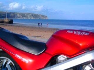
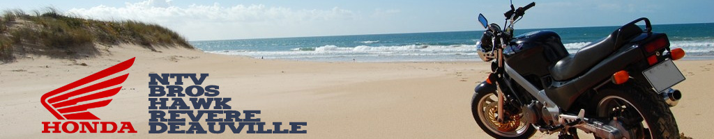
Following on from February and some solid competition. Here is a start for the nominations to consider for March. I have taken those photos that got two or more votes from February (excluding winner) and they are: Click on the thumbnails for the full size image E 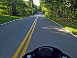 J J 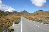 O O 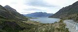 Please send in your nominations by 24 Feb and we'll have the vote for the last few days of the month, then a new background on 01 Mar. Don't forget - you can get your Box Brownie out and take one yourself - A naked Aunty ANTy in the photo will get extra points ;D |
|
|
|
Post by Jaz66 on Feb 5, 2009 12:37:16 GMT 1
Hi Mcf A good call on the Picture competition. Like the format and really looking forward to seeing some naked aunties auNTy's........ ;D Agree we should be sourcing some of the entries from our own pics. Probably did miss some great shots of the recent snow, but i'd rather have a lovely hot summers day to look at right now..  The recent snow is still to too fresh in my mind, pretty though it was..  |
|
JJ
Bad ass biker
 MAD on BIKES
Posts: 417
|
Post by JJ on Feb 5, 2009 13:33:46 GMT 1
"Lovely hot summers day"  what that ? |
|
|
|
Post by Hubcap on Feb 5, 2009 17:14:48 GMT 1
I Like O, very picturesque!
|
|
JJ
Bad ass biker
MAD on BIKES
Posts: 417
|
Post by JJ on Feb 5, 2009 21:02:45 GMT 1
i like E love a glimpse of the bike ;D
|
|
|
|
Post by De Graaf van Salland on Feb 8, 2009 9:56:00 GMT 1
Perhaps, for the next background photo, we should have a photo with a lot of sky in the top half of the photo.
Because, with the current background photo, I have problems finding the navigation bar at the top left hand side of the page.
Or, perhaps, the admin team could change the colour of the letters into white ?
Ride safely
Franklin
|
|
|
|
Post by McF on Feb 8, 2009 12:11:33 GMT 1
I have problems finding the navigation bar at the top left hand side of the page. Franklin I seldom use this Nav Bar so hadn't noticed the impact of this. I can see the frustration of black text on dark background. Only time for a quick look at present. The part we need to change is "Board Title", but I couldn't see where the font colour is controlled for "Board Title" in the skins setup - anyone else got time to look? |
|
|
|
Post by Jaz66 on Feb 8, 2009 14:44:55 GMT 1
hi
had a go at Colour of link
(i take it by nav bar, you mean link at top left of post box, currently displaying in green) and not the nav bar in browser panel?
NB. have changed colour but it affects quite a few other items as well, PLUS it looks different depending on Browser
Used it on Opera, Firefox and Chrome.
Might be one for buzzin to help out with?
Anyone want to go back to default it was...Visited link colour 003399.
Any thoughts, comments please let me know.
will change it back later.
|
|
|
|
Post by rj2para (Bisto) on Feb 8, 2009 17:50:53 GMT 1
Perhaps, for the next background photo, we should have a photo with a lot of sky in the top half of the photo. Because, with the current background photo, I have problems finding the navigation bar at the top left hand side of the page. Or, perhaps, the admin team could change the colour of the letters into white ? Ride safely Franklin Any chance of a screenshot Franklin. What browser are you using please. Happy to help if I can but it would be good to see what you see. As mine looks fine. What I realise does not help much  ATB Roger |
|
|
|
Post by De Graaf van Salland on Feb 8, 2009 19:27:25 GMT 1
This green is a lot better.
Although it looks a bit messy, with the green and blue.
It wasn't really such a big problem. I only suggested a different type of photo for next month.
Also I'm a bit colour-blind, which doesn't help at all.
For browser, I use the windows internet explorer.
Franklin
|
|
|
|
Post by Jaz66 on Feb 8, 2009 22:40:19 GMT 1
Hi Had this up all day, so what do you all think ? is it a keeper, or do we go back to the original? My vote is its garish, and looks unsightly. buy willing to put up with it until we find a suitable alternative, it you all want to keep it |
|
|
|
Post by McF on Feb 9, 2009 8:50:58 GMT 1
I'm mostly using Mozilla Firefox
The text in blue is a little better than black against that part of the background, perhaps try bright green or yellow?
|
|
JJ
Bad ass biker
MAD on BIKES
Posts: 417
|
Post by JJ on Feb 9, 2009 10:37:15 GMT 1
Its looking good from here ;D
|
|
|
|
Post by rj2para (Bisto) on Feb 9, 2009 14:31:08 GMT 1
The problem is the text in question is and acts as a web link. Of which there are many on the site.
(non technically if you click on the text you are taken to another part of the forum)
To change the colour an administrator needs to change the "visited link colour" setting, which then changes lots of other text links on the site. Hence green text all over the site till last night.
Roger
|
|
|
|
Post by Hubcap on Feb 9, 2009 17:39:26 GMT 1
I think it looks rather spiffing in this wonderful purple colour it appears to be on my screen!
The buttons are still a bit hard to see, but there's a way around that if people don't mind clicking and dragging when they want to see the buttons.. lol
|
|


 what that ?